Appearance
Playlist Appearance, Spacing, and Behavior
After you choose a playlist layout, FluentPlayer Pro lets you fine-tune how the playlist looks and behaves on the front end — colors, typography, borders, autoplay, and more. These settings apply to the playlist container and list/grid around the player, not to the inner video player controls (those follow each media item's preset).
Where to Find These Options
Edit your playlist under FluentPlayer → Playlists, then look at the right-hand sidebar. You will find four collapsible panels: General Settings, Layout, Appearance, and Advanced. Click any panel header to expand it. Save the playlist when you are done.
General Settings
This panel controls the top level playback behavior of the playlist.
| Setting | What it does |
|---|---|
| Playlist Title | The name of your playlist as it appears in the editor. |
| Autoplay | When on, the first video starts playing automatically when the page loads. |
| Continuous Play | When on, the player automatically advances to the next video once the current one ends. |
| Loop | When on, the playlist starts over from the first video after the last one finishes. |
| Show Navigation Buttons | Show previous/next controls so viewers can step through the playlist. |
| Show Playlist Menu Toggle | Show a button to open or collapse the playlist list (where the layout supports it). |
| Overlay Mode | Controls how email capture, CTA, and action bar overlays behave across the playlist (see below). |
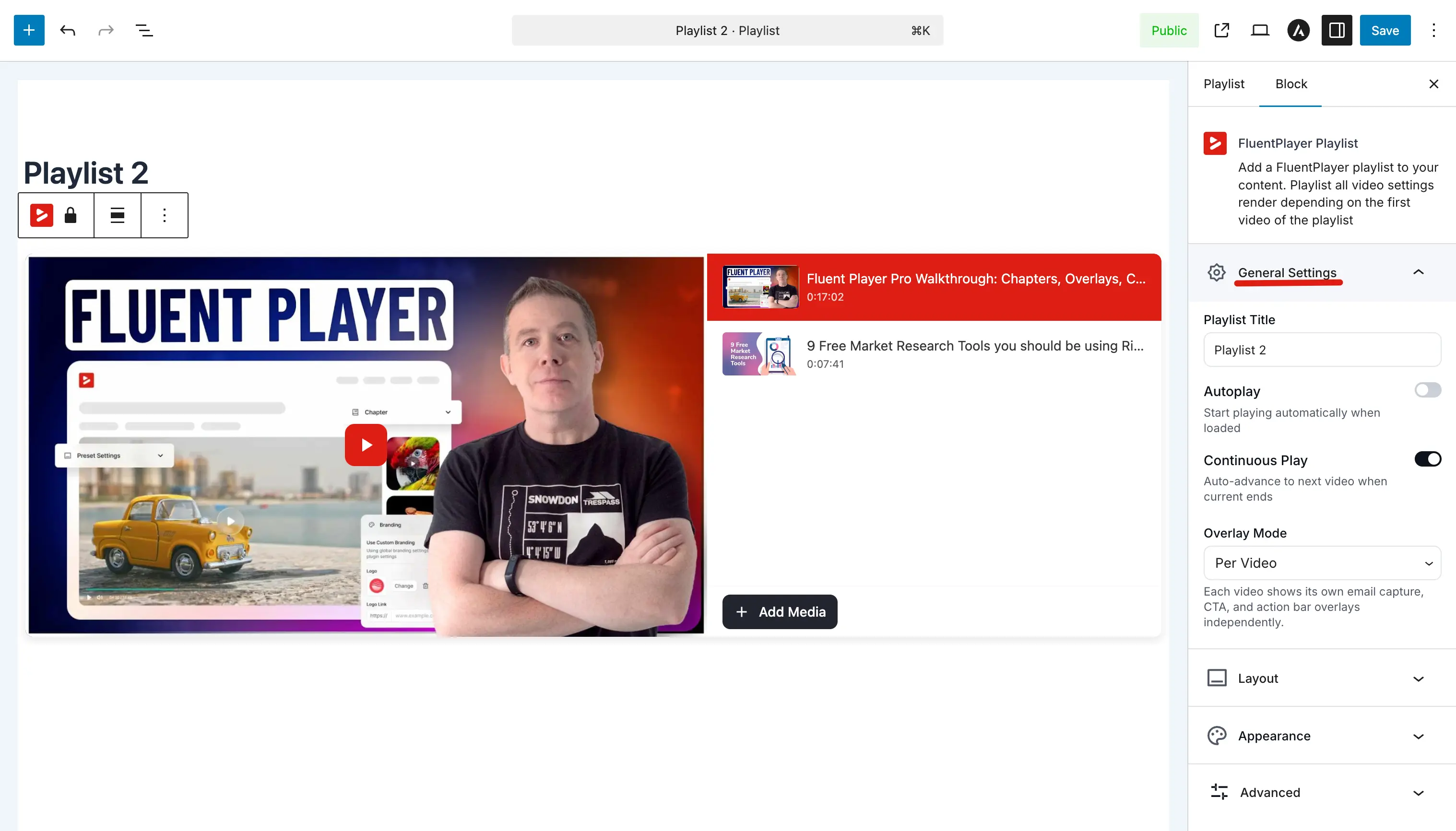
Overlay Mode: Per Video vs Selected Video
The Overlay Mode decides which video's interactive layers — email capture, CTA, action bar, and text overlays — are shown while the playlist plays:
- Per Video — Each video shows its own overlays and layers as it plays. Use this when every lesson or clip has its own call-to-action.
- Selected Video — One chosen video's overlays are applied across the whole playlist, regardless of which item is playing. Use this when you want a single, consistent message for the entire playlist.
Preset Source
A playlist can borrow its player chrome (controls, skin) and brand color from a specific media item's preset. Set a Preset Source media item so the playlist player matches that media's look, with brand-color sync. When no preset source is set, the playlist uses your global defaults.
Playlist visibility
Like media items, a playlist can be public or private. Private playlists are not accessible on their dedicated playlist URL to visitors without edit permission, the same way media visibility works.
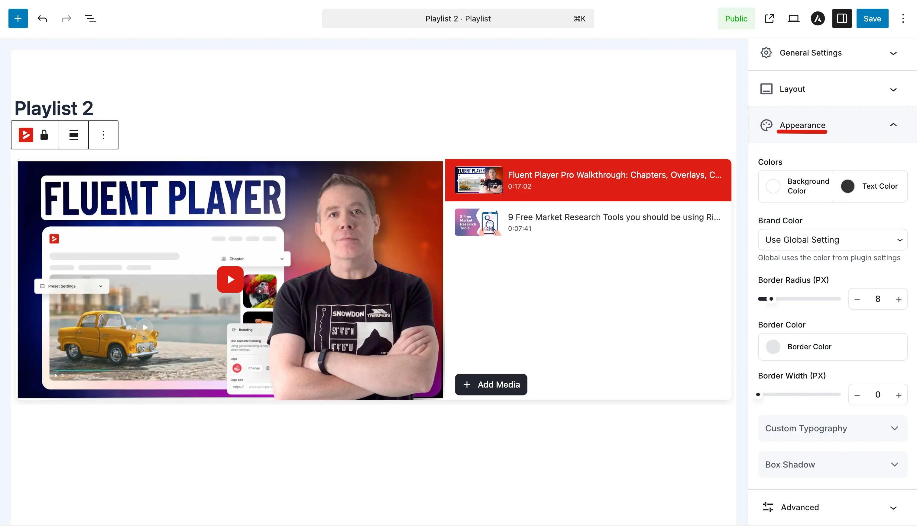
Appearance
Control the playlist frame's colors, borders, and shadow so it matches your site.
Colors
| Setting | What it does |
|---|---|
| Background Color | Background behind the playlist list or grid. |
| Text Color | Color for titles and labels in the playlist UI. |
Brand Color
A dropdown that lets you choose how the playlist accent color is handled:
- Use Global Setting: Inherits the brand color from Branding Settings.
- Custom: Set a unique accent color for this playlist only.
Border
| Setting | What it does |
|---|---|
| Border Radius (PX) | How rounded the playlist container corners are (e.g. 8 for a soft card look, 0 for sharp corners). |
| Border Color | The color of the border around the playlist container. |
| Border Width (PX) | How thick the border is. Set to 0 for no visible border. |
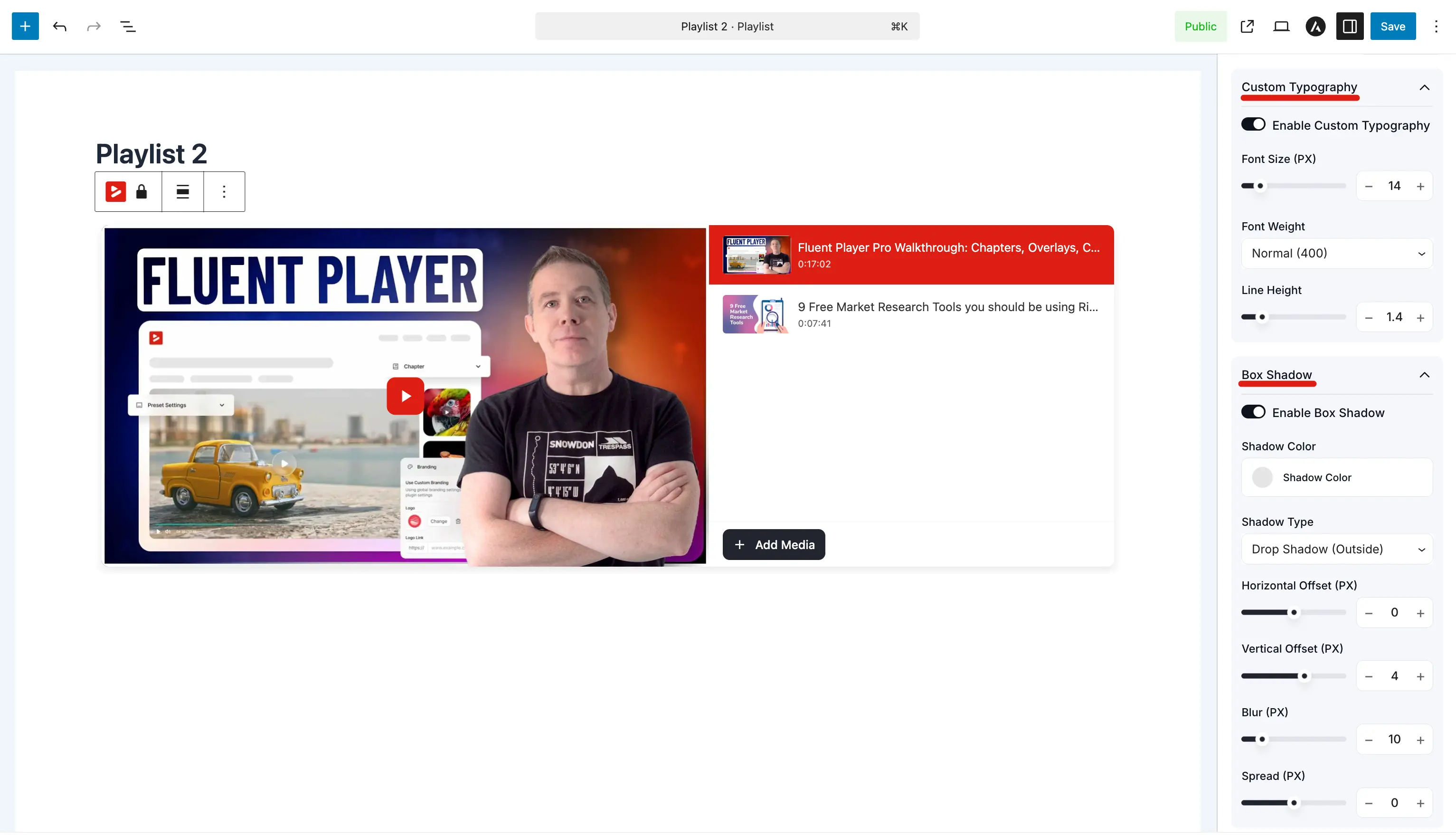
Custom Typography
Optional overrides for playlist text (titles, labels). These controls are nested inside the Appearance panel.
| Setting | What it does |
|---|---|
| Enable Custom Typography | When on, the font settings below apply to playlist text. When off, your theme's defaults apply. |
| Font Size (PX) | Size of the text in the playlist UI. |
| Font Weight | How bold the text appears (e.g. Normal (400), Bold (700)). |
| Line Height | Vertical spacing between lines for multi line titles. |
Box Shadow
Add an optional shadow to give the playlist container depth. These controls are also nested inside the Appearance panel.
| Setting | What it does |
|---|---|
| Enable Box Shadow | Master toggle for the shadow effect. |
| Shadow Color | The color of the shadow. |
| Shadow Type | Drop Shadow (Outside) extends the shadow around the container. |
| Horizontal Offset (PX) | Moves the shadow left or right. |
| Vertical Offset (PX) | Moves the shadow up or down. |
| Blur (PX) | Controls how soft or sharp the shadow edges are. |
| Spread (PX) | Expands or contracts the shadow beyond the container's boundary. |
How This Fits Your Workflow
- Create a playlist and add videos.
- Pick a layout (Standard or Grid) in the Layout panel.
- Use General Settings to configure autoplay, continuous play, and overlay behavior.
- Use Appearance as a checklist for colors, borders, typography, and shadows.
- Embed the playlist on a page and review on desktop and mobile.