Appearance
Creating Custom Presets (Pro)
With FluentPlayer Pro, you can create your own custom presets — fully tailored player configurations that define the skin, controls, behaviors, caption styles, and even engagement overlays like email capture, CTAs, and action bars. Once created, a custom preset works just like the built-in ones and can be applied to any media item on your site.
Why create a custom preset?
The seven built in presets cover common use cases, but they cannot be modified. A custom preset lets you:
- Choose exactly which controls are visible.
- Set specific playback behaviors (autoplay, resume, inline playback).
- Style captions to match your brand.
- Pre configure engagement overlays so every video using the preset has them by default.
How to create a custom preset
- Go to FluentPlayer → Media → Add Media and open any media item.
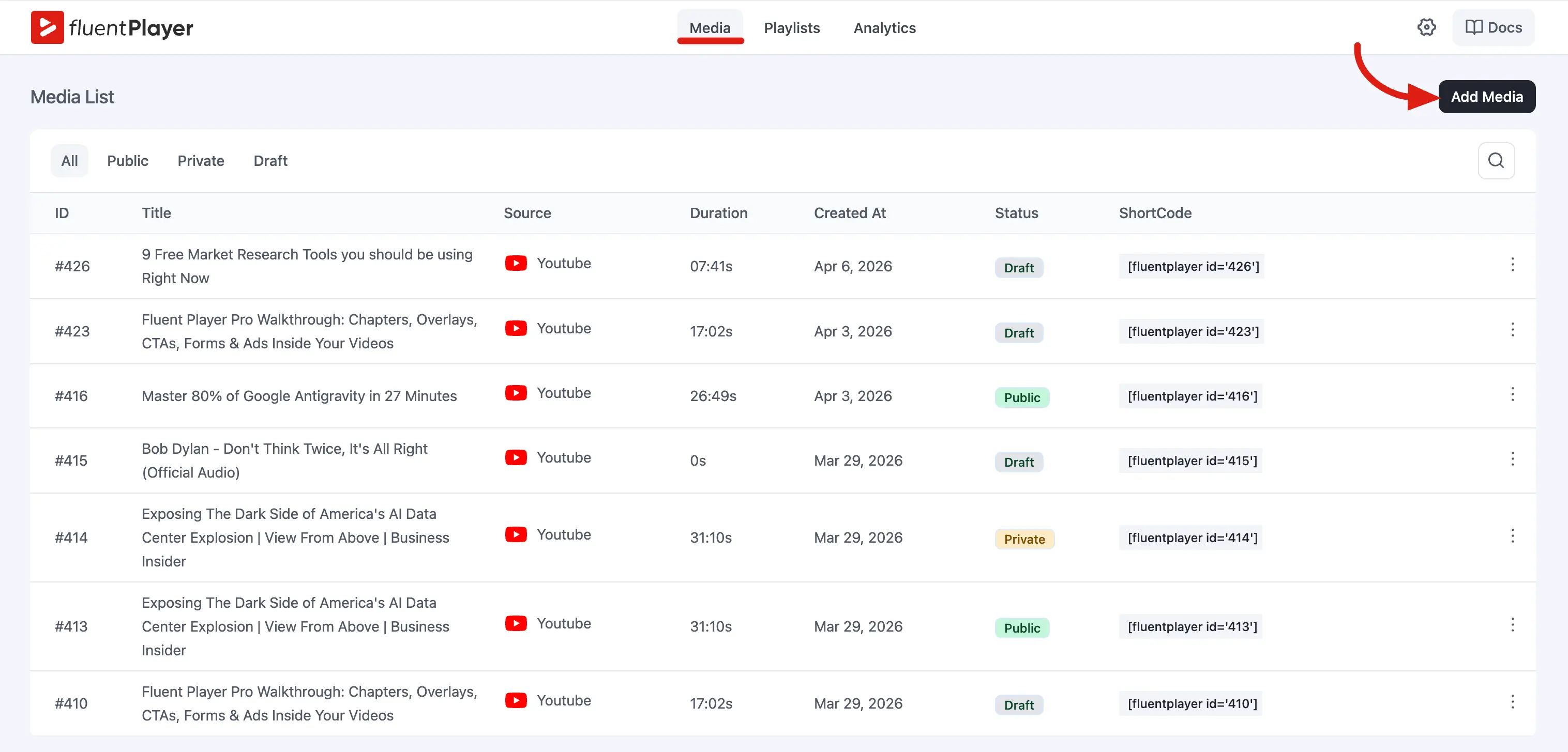
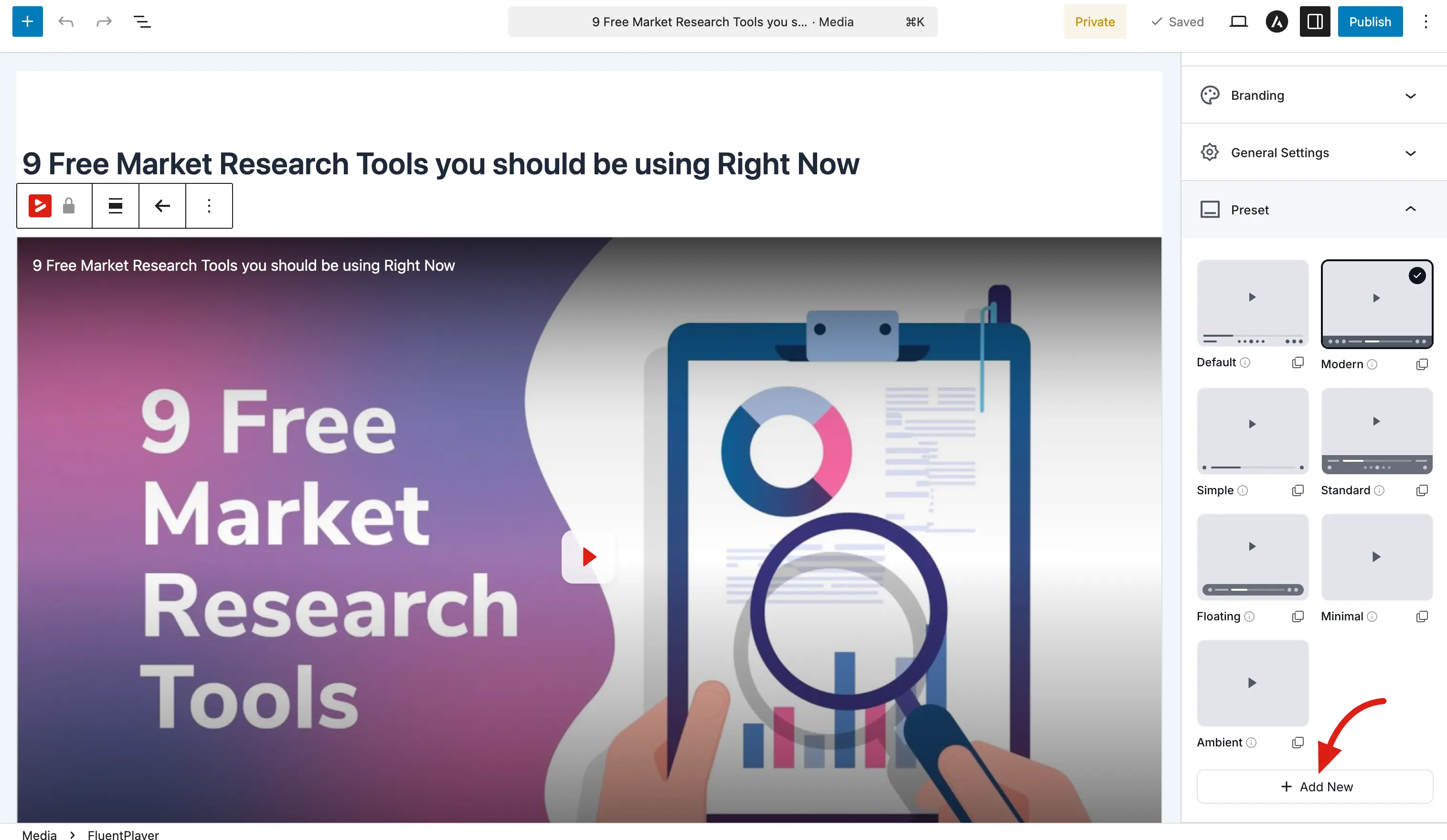
- In the right sidebar, expand the Preset panel. You will see all available presets (Default, Modern, Simple, Standard, Floating, Minimal, Ambient).
- Click + Add New at the bottom of the preset grid.
 \
\
- The Create New Preset dialog opens. Configure each section as described below.
- Click Create Preset when you are done.

Your new preset appears in the preset grid alongside the built in ones. Select it to apply it to the current media, or apply it to any other media item later.
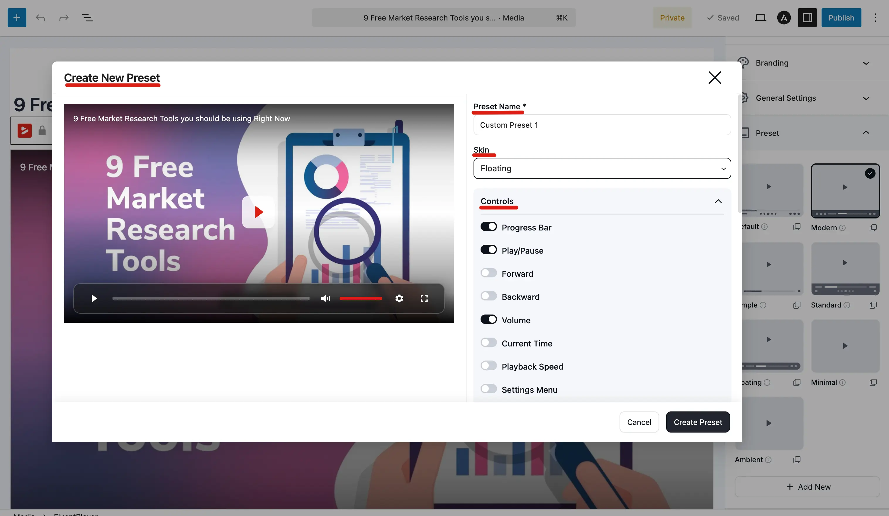
Preset Name and Skin
At the top of the dialog, you will find two required fields:
| Field | Description |
|---|---|
| Preset Name | A name for your preset (e.g., "Custom Preset 1"). This is the label shown in the preset grid. |
| Skin | The visual style of the player. Choose from the dropdown; for example, Floating gives you a transparent control bar that floats over the video. |
Available skins: Classic, Modern, Simple, Standard, Floating, Minimal.
Controls
The Controls section lets you decide which buttons and elements appear on the player. Each control has a toggle: turn it on to show it, off to hide it.
| Control | What it does |
|---|---|
| Progress Bar | The seekable timeline showing playback progress |
| Play/Pause | The main play/pause button in the control bar |
| Forward | Skip forward button (e.g., 10 seconds) |
| Backward | Skip backward button (e.g., 10 seconds) |
| Volume | Volume slider and mute button |
| Current Time | Displays elapsed time and total duration |
| Playback Speed | Let viewers watch at different speeds (0.5x, 1x, 1.5x, 2x, etc.) |
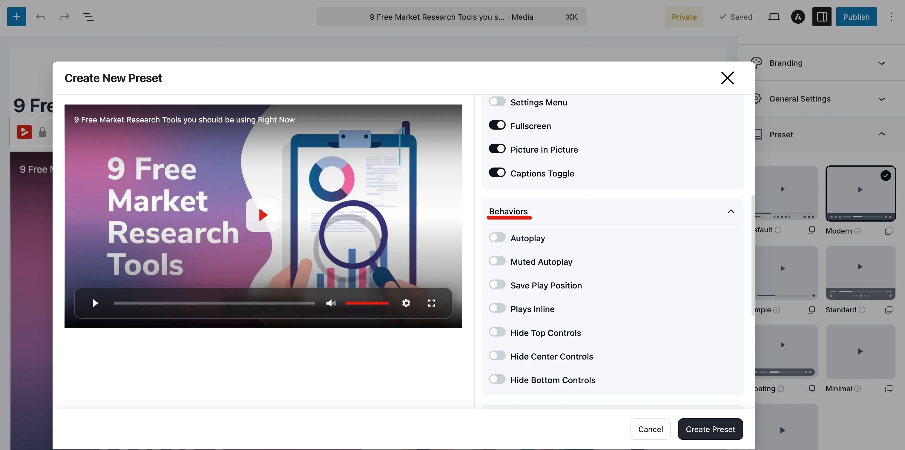
| Settings Menu | A gear icon that opens a menu for quality, speed, captions, and accessibility options |
| Fullscreen | Toggle fullscreen mode |
| Picture In Picture | Detach the video into a floating mini player |
| Captions Toggle | Show or hide subtitles (if subtitle tracks are added) |
TIP
If you enable the Settings Menu, options like playback speed and captions are grouped inside it instead of appearing as separate buttons. This keeps the control bar clean when you have many features enabled.
Behaviors
The Behaviors section controls how the player acts during and after playback. All toggles are off by default; enable only the ones you need.
| Behavior | What it does |
|---|---|
| Autoplay | Start playing automatically when the page loads (subject to browser autoplay policies) |
| Muted Autoplay | Autoplay with the sound muted; most browsers allow this even when regular autoplay is blocked |
| Save Play Position | Remember where the viewer stopped so they can resume later |
| Plays Inline | On mobile, keep the video inside the page instead of opening the native fullscreen player |
| Hide Top Controls | Hide the top area of the player (e.g., the title bar) |
| Hide Center Controls | Hide the large center play button overlay |
| Hide Bottom Controls | Hide the bottom control bar entirely |
TIP
Hiding all three control regions is useful for ambient background videos: the video plays with no visible UI. The built in Ambient preset uses this pattern.
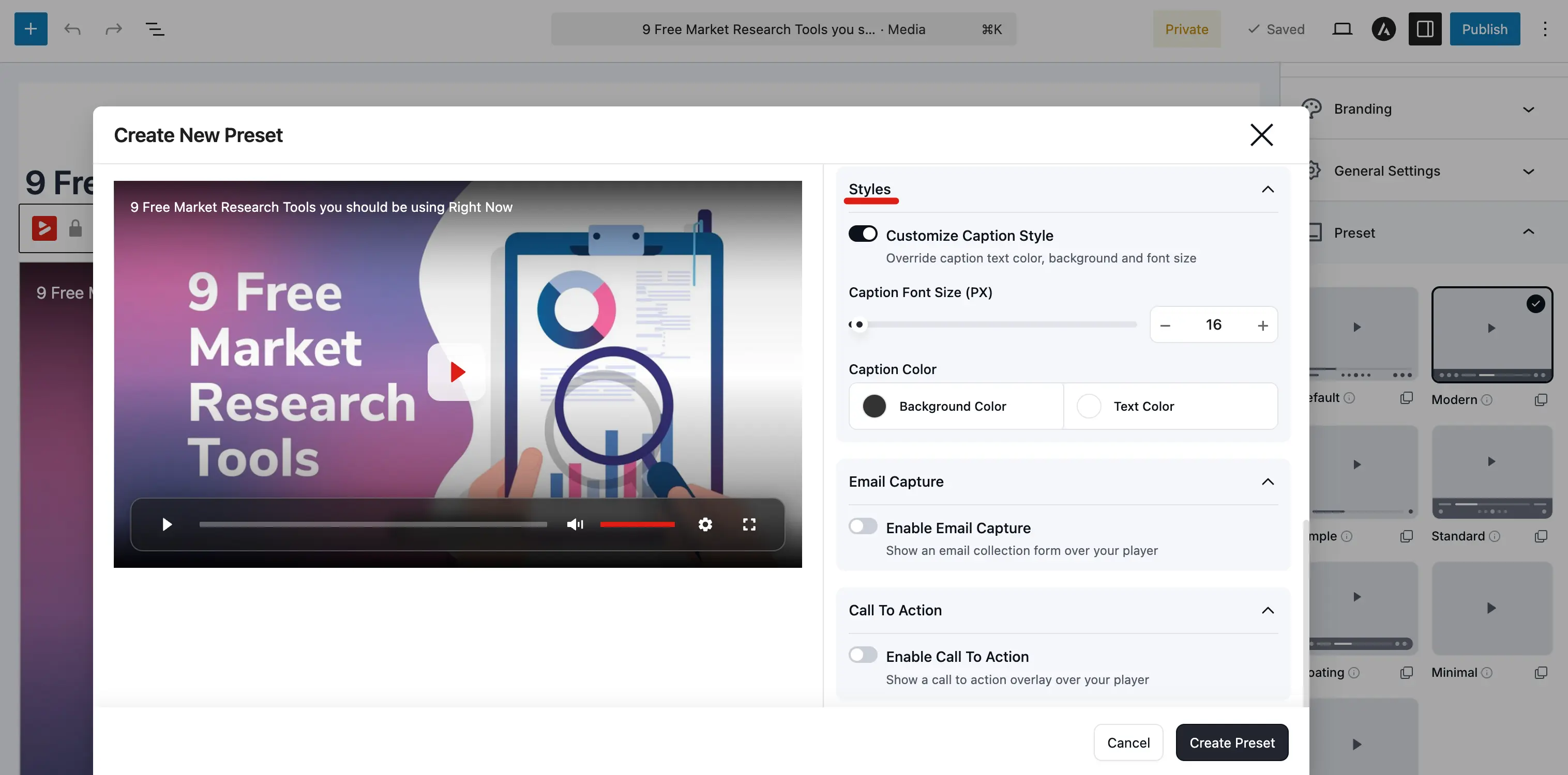
Styles
The Styles section lets you customize how captions (subtitles) look on the player.
| Option | Description |
|---|---|
| Customize Caption Style | Toggle this on to override the default caption appearance |
| Caption Font Size (PX) | Set the font size for subtitle text (e.g., 16) |
| Caption Color: Background | Background color behind the caption text |
| Caption Color: Text | Color of the caption text itself |
These styles apply to every video that uses this preset, so your captions stay consistent across your content.
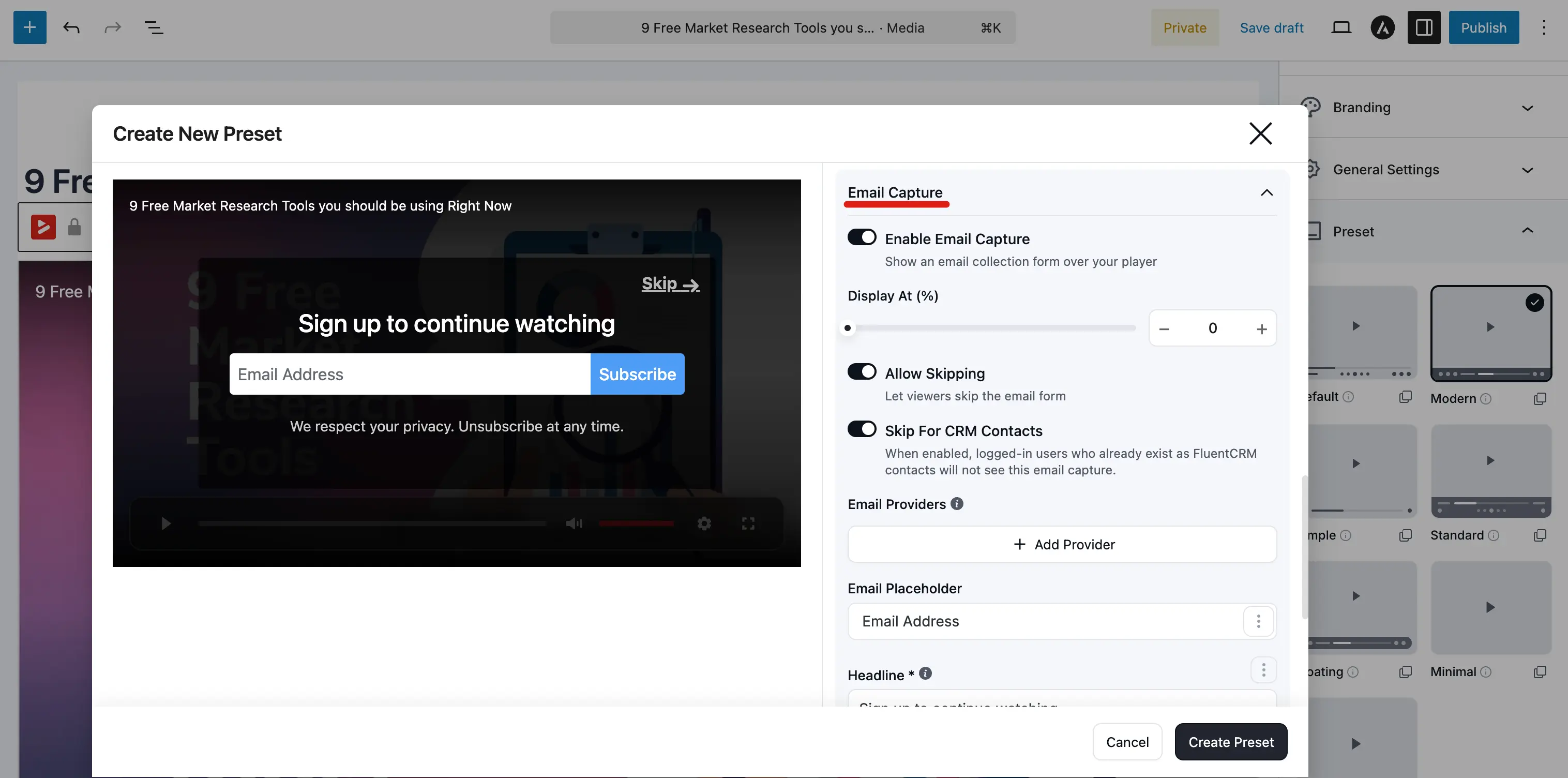
Email Capture
You can pre configure an email capture overlay directly inside the preset. When enabled, every video using this preset will show the email gate at the specified point, with no need to add it as a layer on each media item individually.
| Option | Description |
|---|---|
| Enable Email Capture | Toggle on to show an email collection form over the player |
| Display At (%) | When to show the overlay, as a percentage of the video watched (e.g., 0 for the very start) |
| Allow Skipping | Let viewers skip the email form without entering their address |
| Skip For CRM Contacts | When enabled, logged in users who already exist as FluentCRM contacts will not see the overlay |
| Email Providers | Click + Add Provider to connect a provider (e.g., FluentCRM) with list and tag assignments |
| Email Placeholder | Placeholder text inside the email field (e.g., "Email Address") |
| Headline | Main text above the email field (e.g., "Sign up to continue watching") |
| Button Text | Label on the submit button (e.g., "Subscribe") |
| Bottom Text | Small privacy note below the button (e.g., "We respect your privacy. Unsubscribe at any time.") |
| Button Color | Background and text color of the submit button |
| Border Radius (PX) | Roundness of the button corners (e.g., 4) |
See Email Capture Overlay for a deeper look at how email capture works.
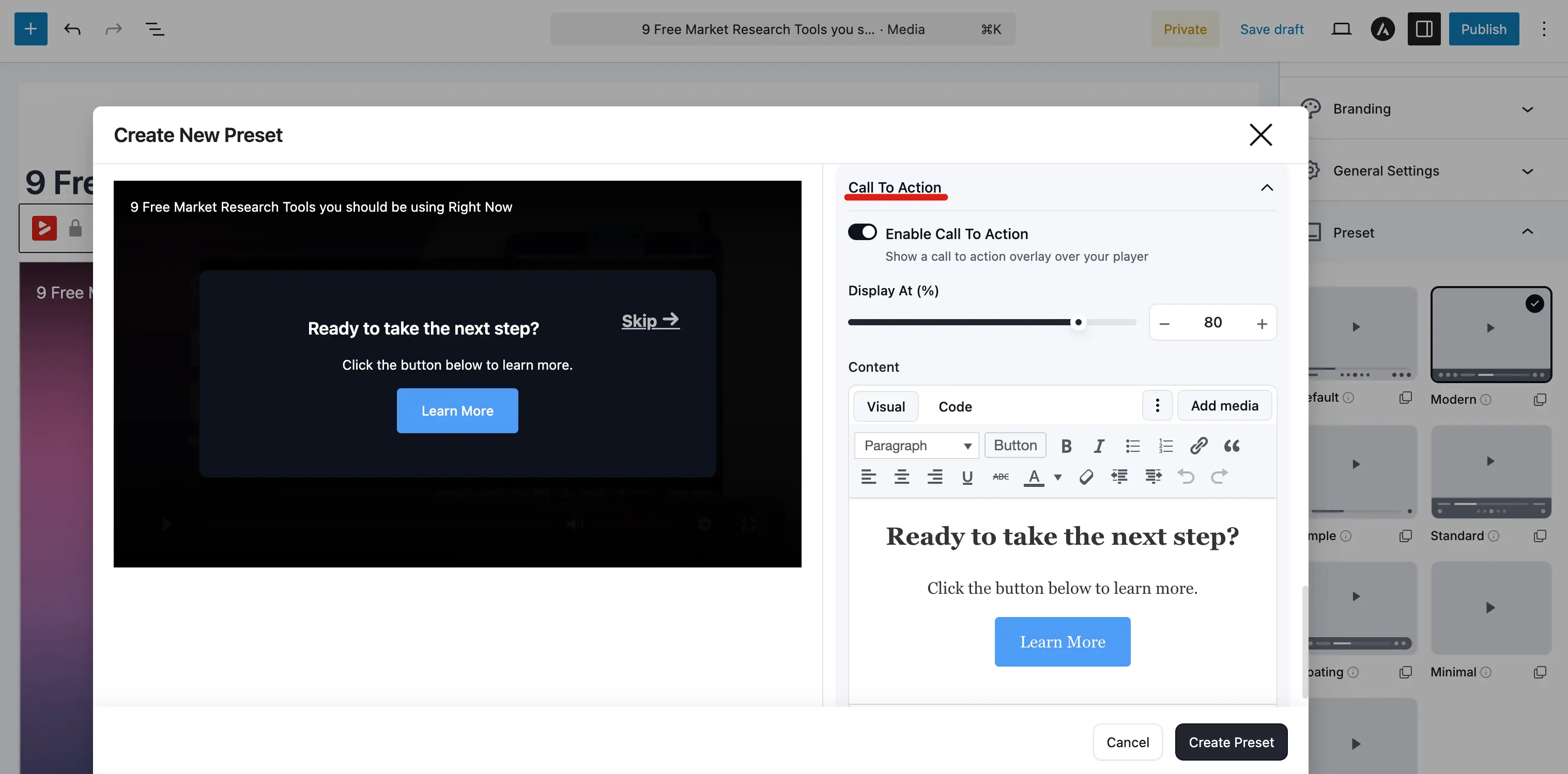
Call To Action
The Call To Action section lets you pre configure a CTA overlay that pauses the video and prompts the viewer to take an action.
| Option | Description |
|---|---|
| Enable Call To Action | Toggle on to show a CTA overlay over the player |
| Display At (%) | When to show the overlay, as a percentage of the video watched (e.g., 80 for near the end) |
| Content | A rich text editor (Visual / Code) where you design the overlay; add headings, text, buttons, images, and links |
| Container Colors | Background and text color for the overlay container |
| Completion Type | What counts as "completing" the overlay; for example, Link Click means the viewer must click a link or button |
| Allow Skipping | Let viewers skip the CTA without clicking |
See CTA Overlay for more details on how the CTA overlay works.
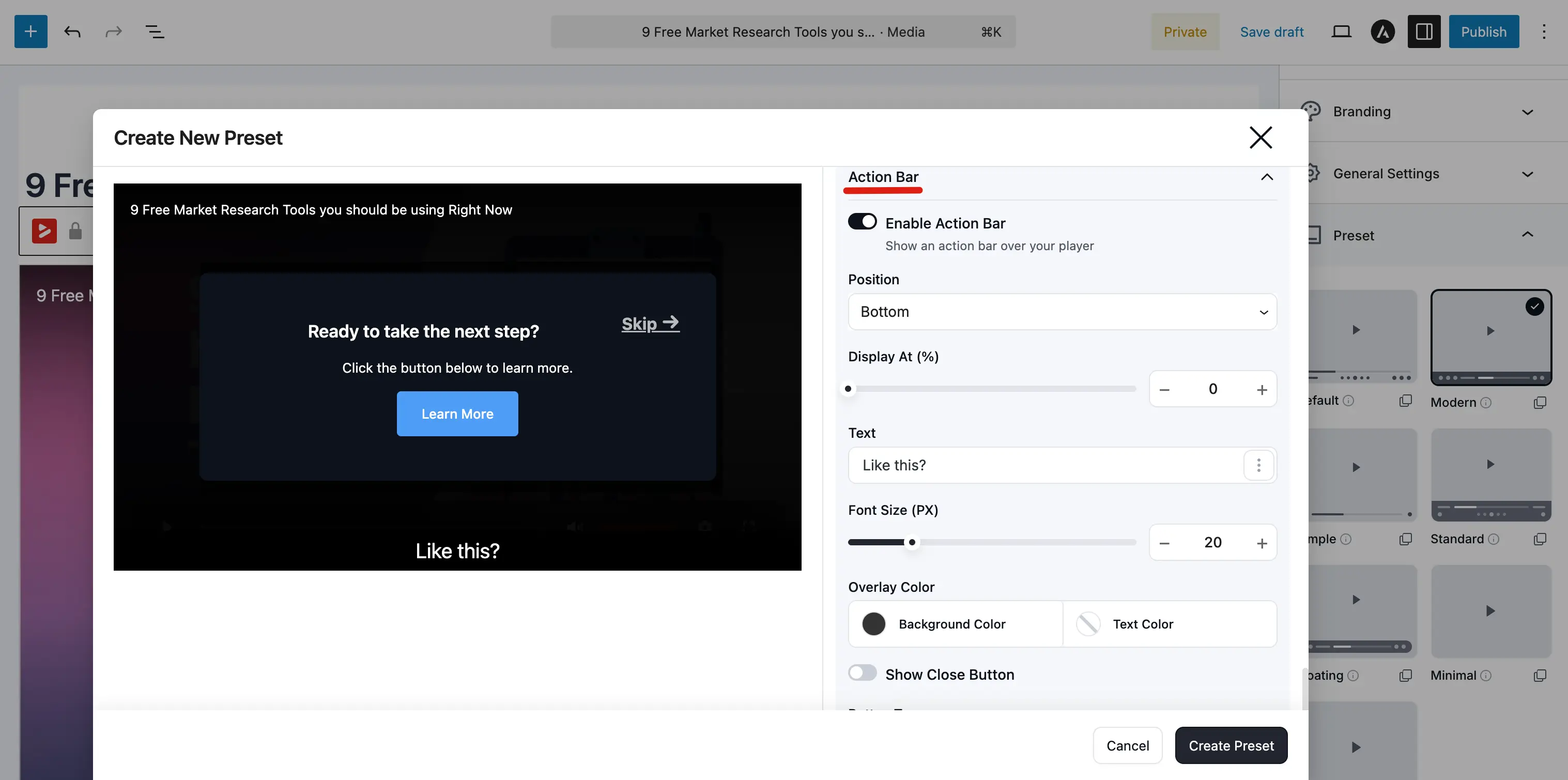
Action Bar
The Action Bar is a slim bar that appears at the top or bottom of the player with a text message and an optional button. Unlike the CTA overlay, the action bar does not pause the video; it slides in while playback continues.
| Option | Description |
|---|---|
| Enable Action Bar | Toggle on to show an action bar over the player |
| Position | Where the bar appears: Top or Bottom of the player |
| Display At (%) | When the bar appears, as a percentage of the video watched (e.g., 0 for immediately) |
| Text | The message to display on the bar (e.g., "Like this?") |
| Font Size (PX) | Font size of the bar text (e.g., 20) |
| Overlay Color | Background and text color of the bar |
| Show Close Button | Let the viewer close the bar |
| Button Type | Type of button on the bar: No Button, Link, or YouTube Subscribe |
When Button Type is set to Link, additional fields appear for the button text, URL, and color. When set to YouTube Subscribe, a field appears for your channel URL.
Context Menu
The Context Menu section controls what happens when a viewer right-clicks the player — FluentPlayer replaces the browser's default menu with its own set of actions. The section header shows how many items are currently enabled (for example, "6 items enabled").
| Toggle | What it does |
|---|---|
| Enable Context Menu | Master switch for the custom right-click menu. Turn it off to fall back to the browser's default menu. |
| Copy Link | Let viewers copy a link to the video. |
| Copy Link At Current Time | Copy a link that opens the video at the current timestamp — handy for pointing someone to a precise moment. |
| Loop | Toggle looping for the video. |
| Playback Speed | Change how fast the video plays. |
| Captions | Toggle subtitles/captions (when subtitle tracks exist). |
| Picture in Picture | Pop the video out into a floating mini-player. |
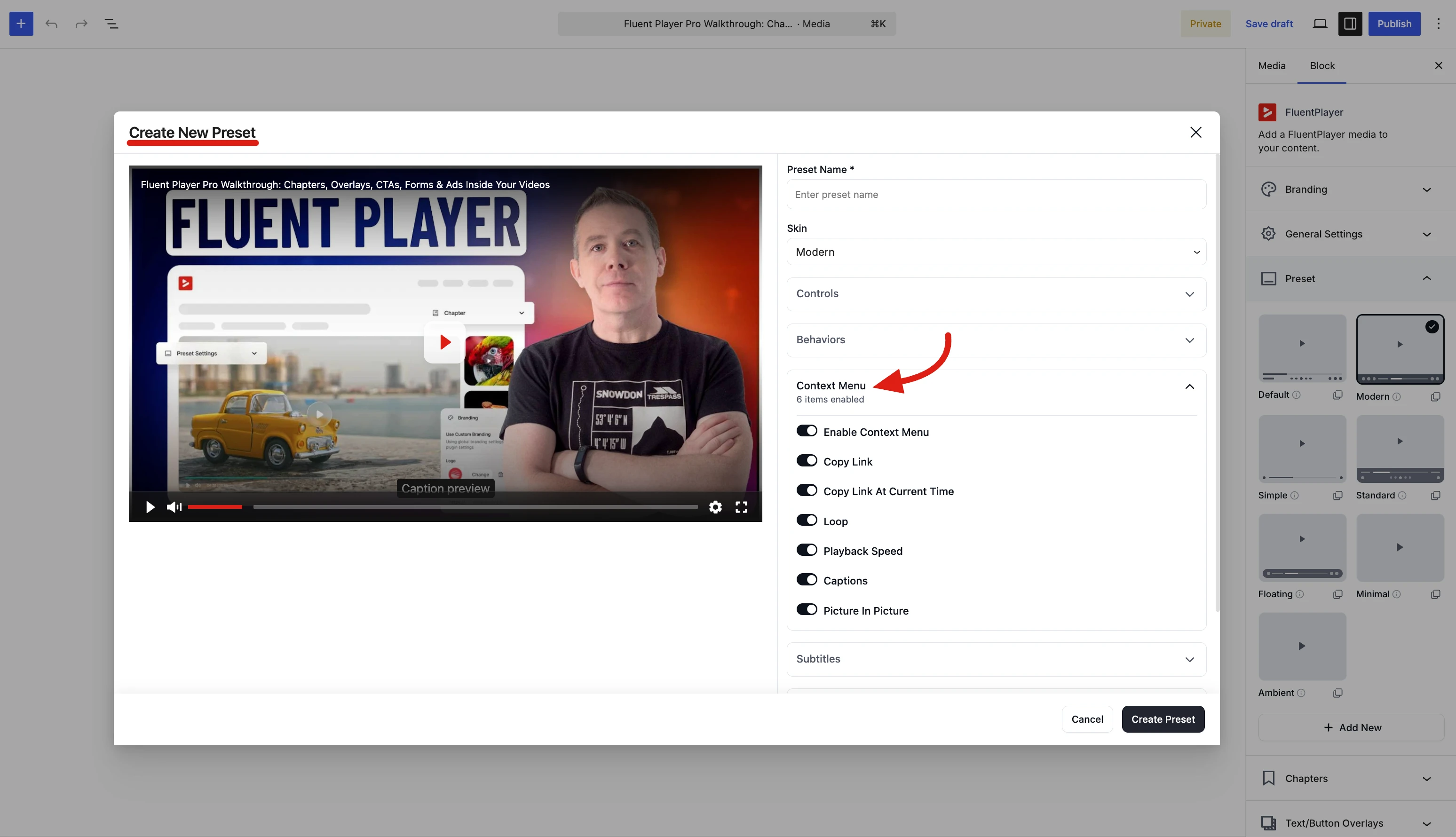
Because these settings live on the preset, every video that uses it shows the same right-click menu.
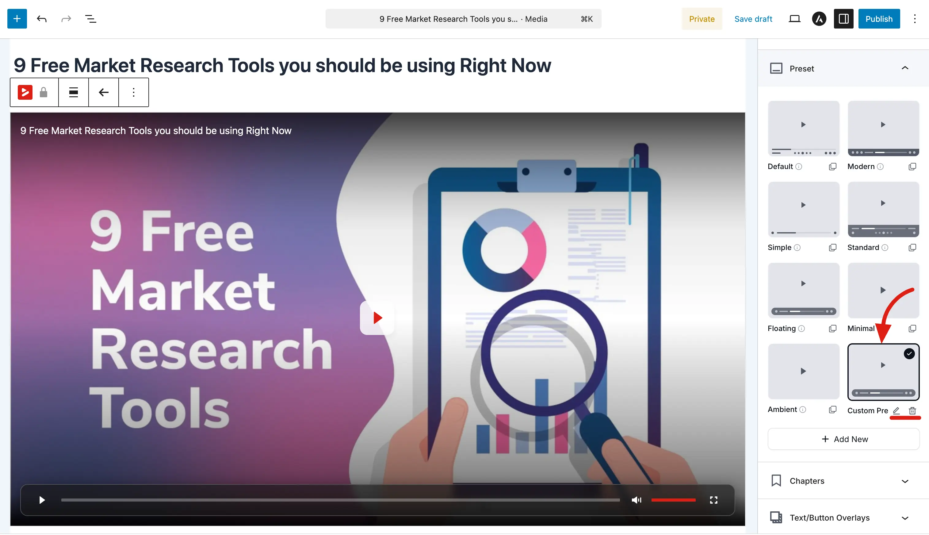
After creating your preset
Once you click Create Preset, your custom preset appears in the Preset panel alongside the built in ones. It shows a thumbnail preview of how the player looks with your configuration.
To use your custom preset:
- Select it by clicking on it in the preset grid; the current media item will use it immediately.
- Apply it to other media by opening any media item, expanding the Preset panel, and selecting your preset.
To make changes later, click the edit (pencil) icon on your custom preset in the grid. To remove it, click the delete (trash) icon.
TIP
Custom presets are great for teams. Create one preset for tutorials, another for marketing videos, and another for background loops; then let anyone on your team pick the right one when they add a new video.