

Appearance
Playlist Layouts
When you create a playlist, you choose a layout that controls how it is displayed on the front end. FluentPlayer Pro offers two distinct layout styles Standard and Grid each designed for a different use case to help viewers browse and watch your video collections seamlessly.
To configure the layout, open your playlist and expand the Layout panel in the right sidebar under the Block tab.
Standard Layout
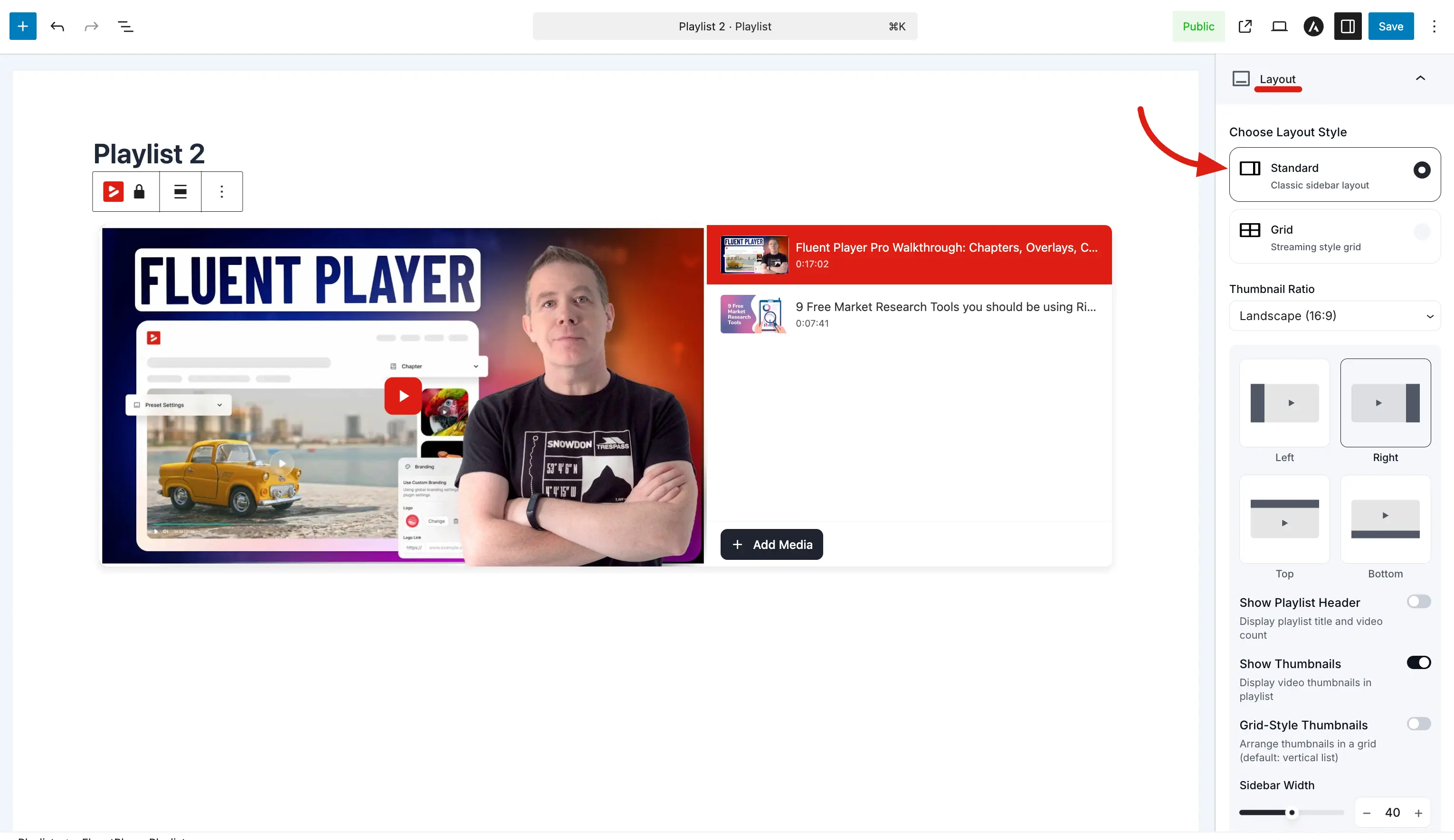
The Standard layout shows the main video player with an interactive playlist sidebar positioned beside it. Each item in the sidebar displays a thumbnail and title, making it easy for viewers to browse and switch between sequential videos.
Features and Options
Player Ratio: Select the aspect ratio for your main player from the dropdown menu, choosing Default (Original) or other standard dimensional presets.
Sidebar Position: Place the playlist sidebar strip relative to the main player. Click the visual block selector to choose Left, Right, Top, or Bottom.
Show Playlist Header: Toggle this switch on to display the playlist title and total video count directly above the sidebar list.
Show Thumbnails: Enable this option on to display video thumbnails in the sidebar. When toggled off, items show as a text-only list.
Grid-Style Thumbnails: Enable this switch to arrange thumbnails in a grid instead of a single vertical list, which is highly useful for a compact sidebar layout when you have many videos.
Show Video Title: Switch this toggle on to display the video title on each thumbnail item in the sidebar.
Title Position: Choose where the text appears using the dropdown menu, selecting either Overlay on Thumbnail or Below Thumbnail.
Sidebar Width: Use the slider or click the plus/minus buttons to set the width of the playlist sidebar as a percentage of the total player area (e.g., 40).
Best For: Video series, ordered tutorials, episodes, product demos, and small to medium collections containing 5–20 videos where sequential browsing is preferred.
Grid Layout
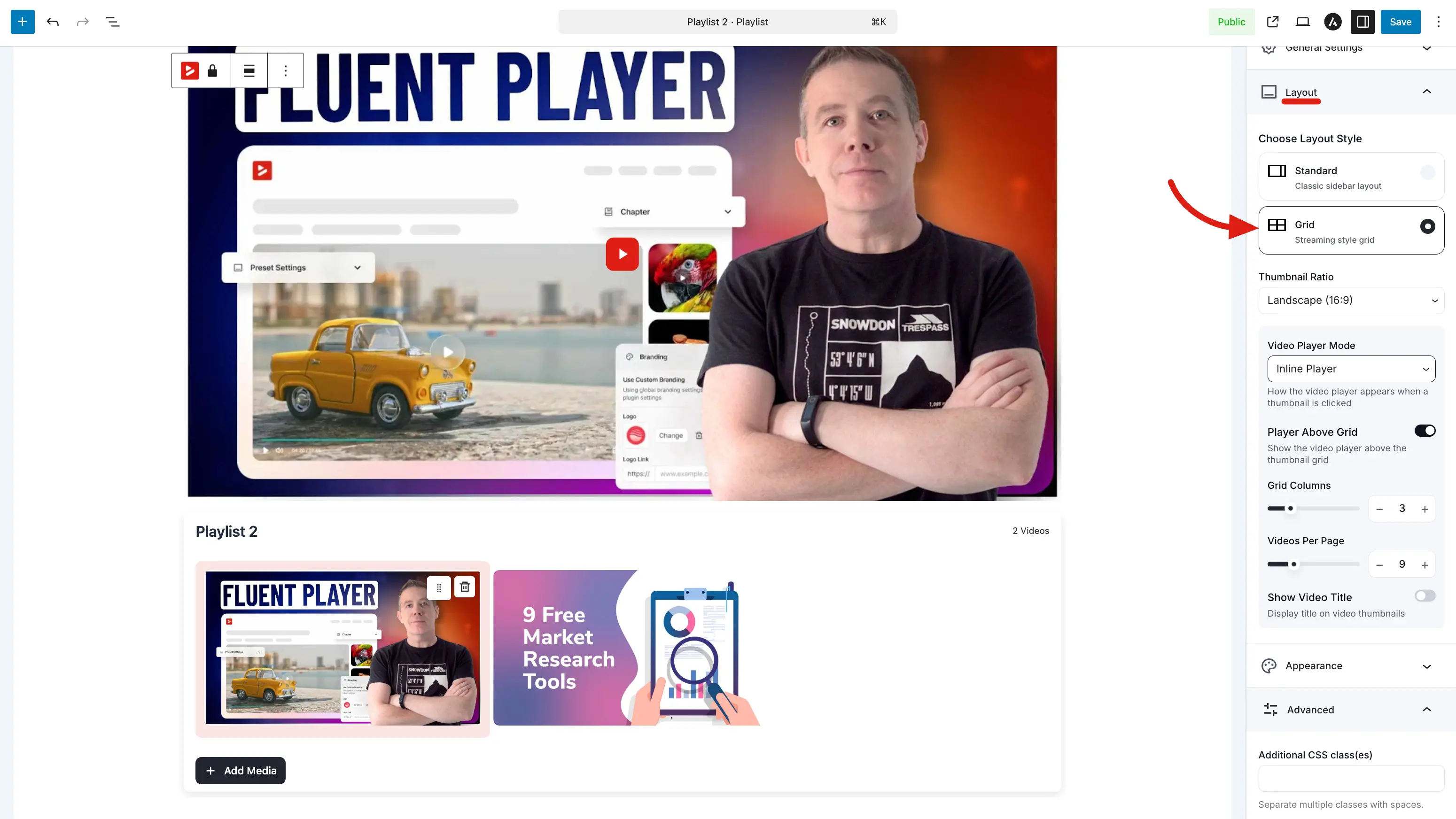
The Grid layout arranges your videos into a multi-column thumbnail catalog grid. This style is perfect for large video archives, catalogs, and resource libraries where strict sequential watching does not matter.
Features and Options
Video Player Mode: Use the dropdown menu to select how a video opens when a thumbnail is clicked. Select Inline Player to load the video in a player block positioned above the grid, or select Modal Overlay to open the video in a popup overlay on top of the page.
Player Above Grid: Toggle this setting on to show the video player block above the thumbnail grid layout. Clicking any thumbnail instantly loads that video into the active player area at the top.
Grid Columns: Move the slider or type a number to set the number of columns in your grid layout (e.g., 3).
Videos Per Page: Set how many videos to display per page (e.g., 12) to control pagination and keep your pages loading fast.
Show Video Title: Toggle this switch on to display the title text on each thumbnail item within the grid layout.
Title Position: Select from the dropdown option to position the title text either as Overlay on Thumbnail or Below Thumbnail.
Modal Options
When Video Player Mode is set to Modal Overlay, these additional options apply:
| Option | Description |
|---|---|
| Enable Fullscreen Mode | Allow the modal player to expand to fullscreen. |
| Modal Layout | How the modal is positioned — for example Centered (the default). |
| Modal Show Info | Show the video's title and details inside the modal alongside the player. |
Best For: Large video libraries (20+ videos), content catalogs, archives, and browsing-oriented resource centers.
The Layout panel provides the essential building blocks to structure your video collections. By choosing the Standard layout for step-by-step series or the Grid layout for vast video libraries, you can create a highly professional viewing experience tailored precisely to your content.